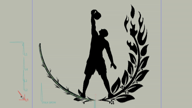
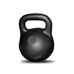
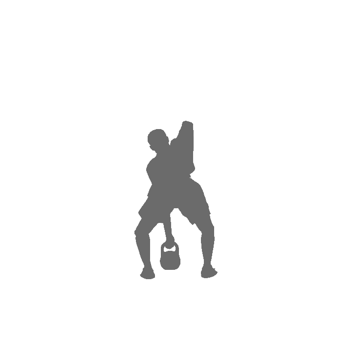
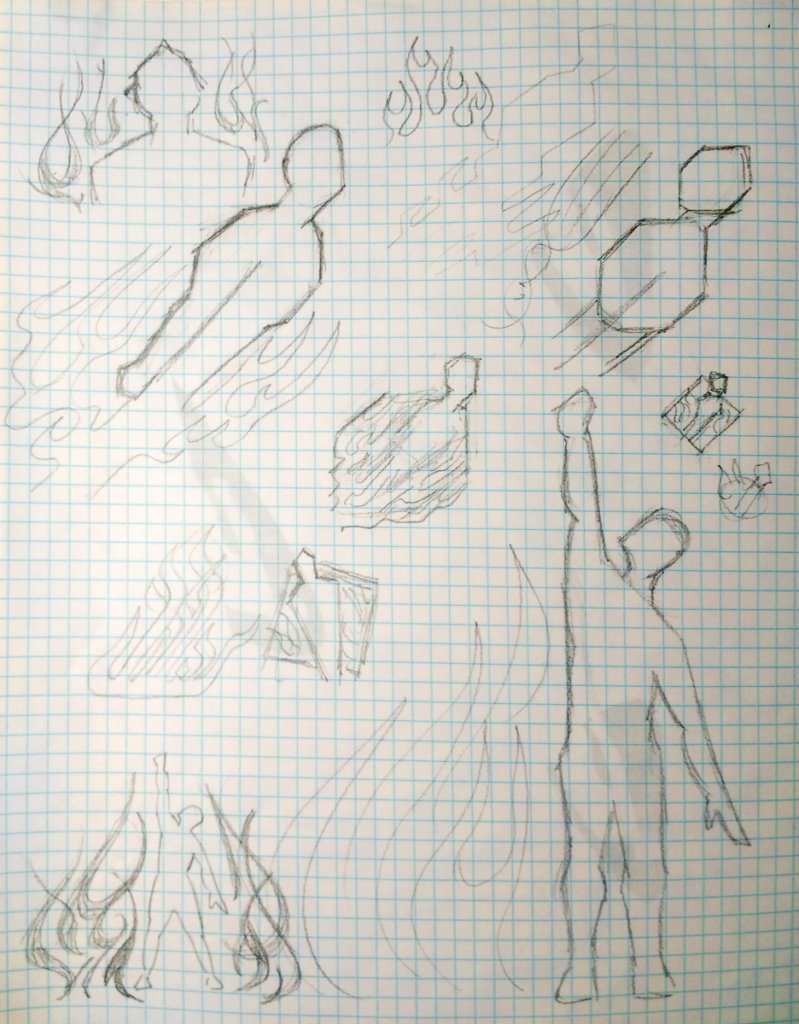
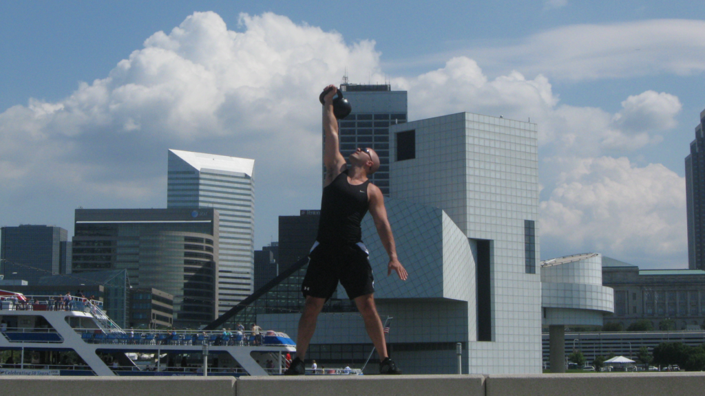
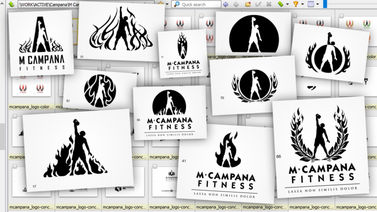
The silhouette of Mark lifting a kettlebell was determined to be the best concept to serve as the focal point of the logo. But it needed a little more. Dozens of variations of the design were tried before we landed on just the right version.
Since the silhouetted pose seemed to evoke ancient Greek black-figure pottery, I framed the logo with another emblem of the times — the laurel wreath — to symbolize athleticism.
Having the laurel leaves morph into flames proved to be just the right finishing touch.
In some versions I incorporated Lassa non similis dolor, Latin for Mark's motto "Tired isn't pain."

When it came time to update the website with a new design, I created an animated version of the logo using Moho Pro animation software.
I created a rig of the silhouette so the body could actually be made to raise the kettlebell into the air, and I rigged the leaves so they could individually sprout and ultimately burst into flame. With rigged animation I could precisely control the timing of the logo build.